Wellim
Branding, Illustration & Motion Design | 2024
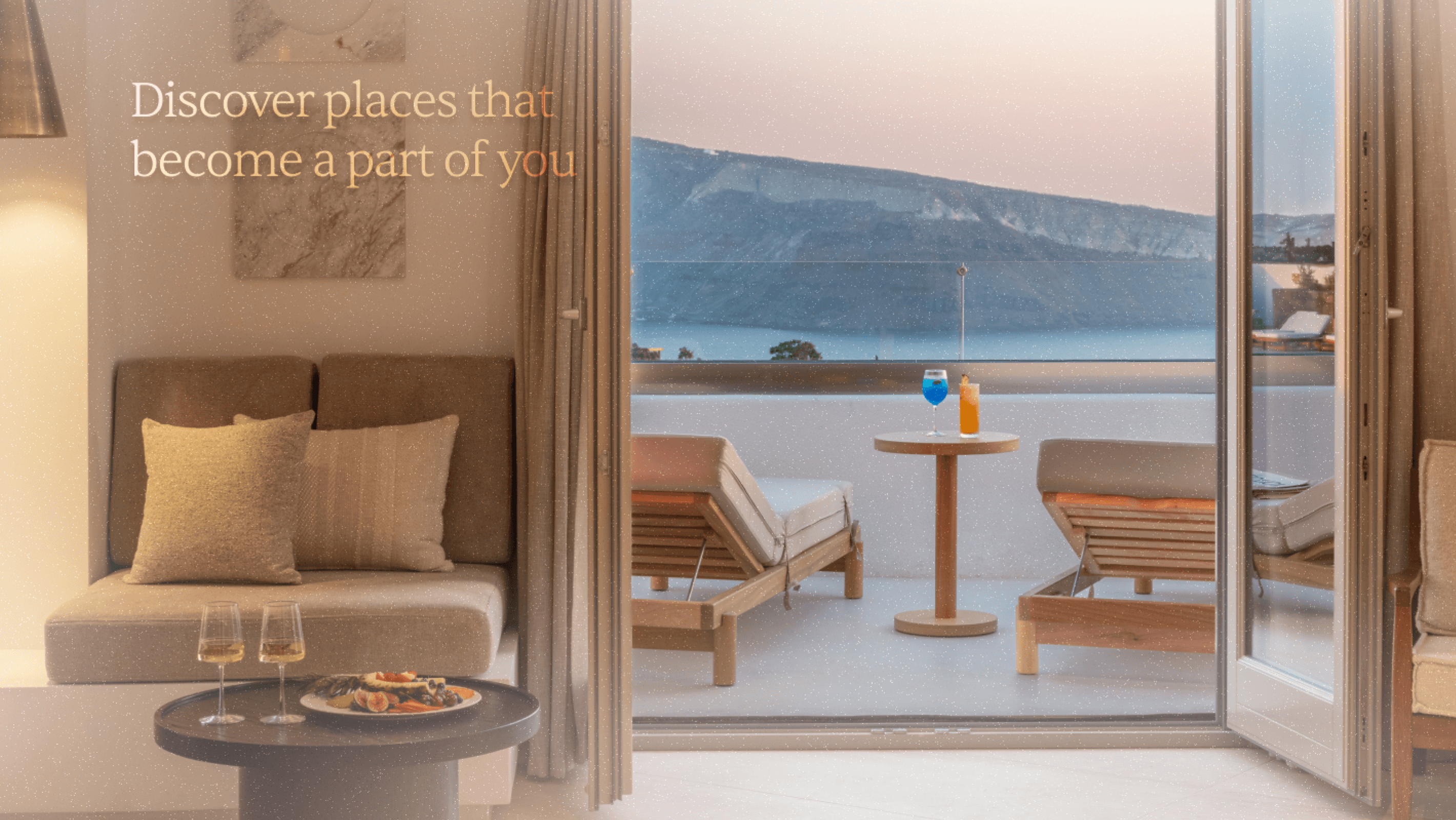
Wellim is a hospitality brand built on the idea of perfect alignment—connecting travelers to hotels that resonate with who they are and what they seek. The brand draws inspiration from the eclipse, a symbol of rare and seamless connection, reflected in its logo and visual language. This project involved building the brand from the ground up—crafting the identity, motion design, website, and illustrations, all tied together through a cohesive strategy rooted in harmony and personalization.

Introduction
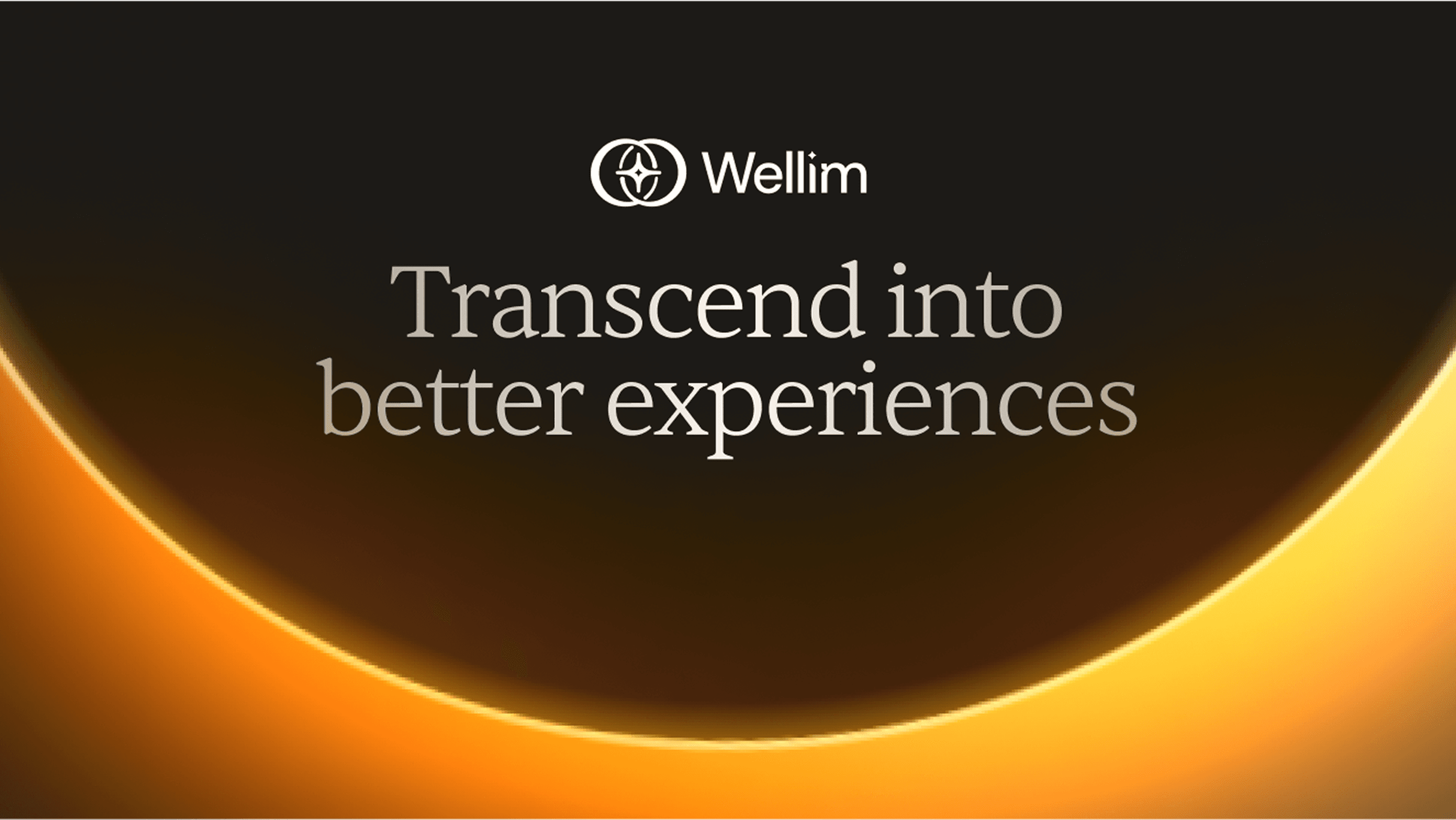
Wellim is not just a luxury destination, it is an experience that embodies tranquility, renewal, and intentionality. Designed for discerning individuals who prioritise depth over opulence, Wellim positions itself as a brand that invites users to “transcend into better experiences.”
Challenge
To craft a visual identity and communication strategy that reflects luxury without being loud, one that connects emotionally with modern travellers seeking quiet sophistication and soul-deep rest.

Strategy
By anchoring the brand in natural metaphors (eclipse, warm light, soft spaces), Wellim creates a feeling of calm anticipation. Every touchpoint, from website to social media evokes peace and exclusivity.

Brand Essence
Wellim is crafted for individuals who seek luxurious, meaningful escapes. It positions itself at the intersection of well-being and elevated living, targeting discerning travelers or clients who value immersive comfort and curated serenity.


